Distorted display typeface that simulates impaired vision for headlines
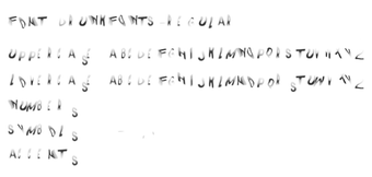
Drunk Fonts, by Drunk Fonts, is a display typeface designed to represent visual impairment and inebriation through letterform distortion. The font renders shaky strokes and a wobbly baseline to create a chaotic headline treatment and visual emphasis in posters or social campaigns. It ships as standard OpenType and TrueType files with a limited glyph set and a lightweight installer, aimed at graphic designers, campaigners, and content creators who need a striking, message-driven display face.
What the font does to headline typography
The font intentionally distorts letter shapes to mimic impaired focus: characters use irregular strokes, a wobbly baseline, and uneven spacing to produce readable but visibly unstable text. It targets short, high-impact uses rather than continuous typesetting. Supported file formats are provided as standard OTF and TTF, so the face loads through the system font library and appears in any application that accesses installed fonts.
How designers can control appearance and placement
Control happens at layout and scale rather than internal weights. The face is a display-style option intended for headlines, posters, and experimental editorial layouts, so designers manage intensity by changing point size, letter-spacing, and pairing with neutral body faces. The glyph set covers basic Latin alphanumerics, which limits typography choices for extended language or special-symbol work.
Installation, daily use, and system footprint
Installation follows the standard font workflow: extract the ZIP, right-click the OTF/TTF file, and choose Install. The package is described as lightweight, so it adds minimal overhead to the system font directory and shows up in applications such as office suites and creative apps without additional plugins. Daily use involves selecting the face for short text blocks rather than long paragraphs.
Compatibility, provenance, and audience fit
Compatibility spans current Windows desktops and common creative software, and the face also runs on other platforms that accept OTF/TTF files. The design studio behind the project is identified as VSV Belgium, and the face is distributed with a clear awareness concept that frames its use in safety or activist messaging. The font’s high-download presence indicates notable interest from designers and campaign creators.
Decisive choice for short, message-driven headlines with a clear purpose
The font is a purposeful option for designers and activists who need typography that communicates impaired vision as part of a campaign or visual statement. Use it sparingly for headlines and pairing with neutral text faces; test legibility at intended sizes and set a fallback font for longer copy. It fits projects that accept a deliberate, provocative aesthetic and limited character coverage.